
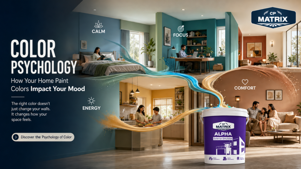
Long before you notice the furniture, the layout, or the lighting in a room, your brain has already reacted to one thing: color. Research in environmental psychology shows that wall color can measurably shift heart rate, stress hormones, appetite, and focus within seconds of entering a space. In other words, the paint on your walls isn’t just decoration — it’s a daily, silent influence on how you feel at home.
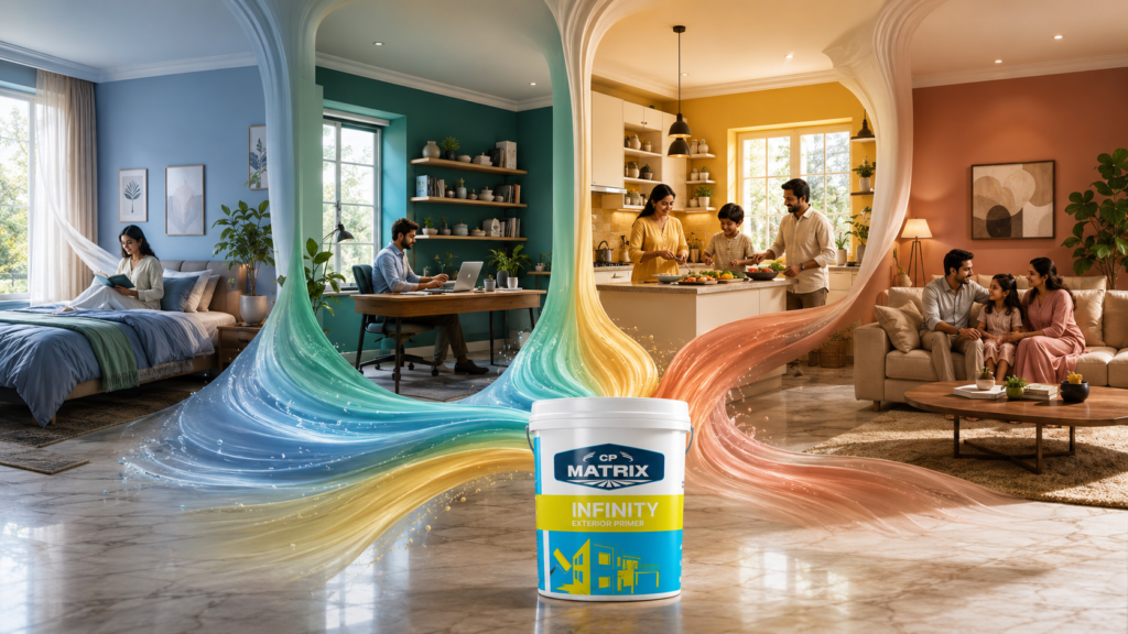
This guide breaks down the real psychology behind paint colors, room by room, so you can choose shades that don’t just look good in photos but actually support how you want to feel — calmer in the bedroom, sharper in the home office, more energized in the kitchen, and more relaxed in the living room.
Table of Contents
What Is Color Psychology, Really?
Color psychology is the study of how hues influence human emotion, behavior, and physiological response. It sits at the intersection of neuroscience, design, and culture — some reactions to color (like red raising alertness) appear to be near-universal, while others (like which colors read as “lucky” or “mourning”) are shaped by culture and personal memory.
For your home, this means two things matter equally:
- The general psychology of the hue (what most people tend to feel around blue, red, yellow, etc.)
- Your personal associations with that color (a soft yellow might feel cheerful to one person and remind another of a childhood kitchen they didn’t enjoy)
The best home color choices balance both — general psychological principles as a starting point, personalized by how a shade actually makes you feel when you stand in front of it.
How Paint Color Physically Affects Your Brain and Body
- Wavelength and arousal: Warmer, longer-wavelength colors (red, orange) are associated with increased alertness and can raise heart rate and blood pressure slightly. Cooler, shorter-wavelength colors (blue, green) tend to have the opposite, calming effect.
- Cortisol and stress: Soft, muted, and cooler tones are linked to lower reported stress levels compared to highly saturated, high-contrast color schemes.
- Light reflection: Lighter colors reflect more ambient light, which can make spaces feel more open and airy — this affects mood indirectly by influencing perceived room size and natural light levels.
- Circadian associations: Deeper, warmer tones in bedrooms are often linked with better perceived sleep quality because they visually mimic evening light and reduce the “activating” effect of bright, cool tones before bed.
None of this means color alone will “cure” stress or insomnia — but it is a low-cost, high-impact lever you control completely, unlike layout or natural light.
Warm Colors: Energy, Appetite, and Optimism
Warm colors sit on the red-orange-yellow side of the wheel. They’re associated with energy, sociability, and appetite stimulation — which is exactly why they show up so often in restaurants and kitchens.
| Color | Common Emotional Association | Best Used In |
| Red | Excitement, urgency, passion, appetite | Dining rooms, entryways (as an accent) |
| Orange | Enthusiasm, warmth, playful energy | Kitchens, gyms, kids’ play areas |
| Yellow | Optimism, cheerfulness, alertness | Kitchens, hallways, home offices (muted tones) |
| Terracotta / Rust | Groundedness, warmth, coziness | Living rooms, dens |
Where warm tones work best: high-traffic, social spaces — living rooms, kitchens, dining areas — where you want conversation and energy.
Where to be careful: Saturated warm colors used across an entire room, especially a bedroom, can feel visually “loud” and overstimulating over time. Use them as accent walls, trim, or in smaller, muted doses (terracotta, dusty coral, warm sand) rather than full-strength on every wall.
Cool Colors: Calm, Focus, and Rest
Cool colors — blue, green, and violet — are consistently rated in design and psychology research as the most calming color family. They’re associated with lower blood pressure, slower breathing, and a general sense of safety and order.
| Color | Common Emotional Association | Best Used In |
| Blue | Calm, trust, focus, stability | Bedrooms, bathrooms, home offices |
| Green | Balance, renewal, connection to nature | Bedrooms, living rooms, home offices |
| Soft Violet / Lavender | Relaxation, introspection, gentle luxury | Bedrooms, meditation or reading nooks |
| Teal | Clarity, calm sophistication | Bathrooms, studies |
Why cool tones dominate bedroom and wellness-space recommendations: they’re the shades most reliably linked to lower reported anxiety and better perceived sleep quality, largely because they don’t compete for the brain’s attention the way high-saturation warm colors do.
Neutrals: The Emotional Reset Button
Neutrals — white, beige, greige, taupe, warm grey, off-white — don’t get as much attention in color psychology conversations, but they play a critical regulatory role: they lower visual “noise” and let your brain rest.
- Warm neutrals (beige, taupe, warm greige) feel cozy and grounded — good for living rooms and family spaces.
- Cool neutrals (soft grey, cool white) feel crisp and orderly — good for home offices and bathrooms.
- Pure white, while clean, can feel sterile or cold in large, low-light spaces if not paired with warm textures and lighting.
Neutrals are also the safest long-term choice if you tend to change your mind about decor often — they act as a canvas, letting you shift mood with furniture, art, and accent walls instead of repainting.
Best Paint Colors by Room
Living Room
Living rooms handle multiple moods — conversation, relaxation, entertaining — so a warm neutral base (greige, warm taupe, soft sage) with one accent wall in a deeper warm or earthy tone tends to work best. This balances sociability with comfort.
Bedroom
Prioritize calm over statement-making. Soft blues, sage or muted green, warm greige, and gentle lavender are consistently the top-recommended bedroom colors for supporting rest and lowering pre-sleep stimulation. Avoid highly saturated reds, oranges, and bright yellows here — they’re too activating for a room built around winding down.
Kitchen
Kitchens benefit from warmth and energy — soft yellow, warm white, sage green, and terracotta all support appetite and morning alertness without feeling aggressive. If your kitchen is small or low on natural light, lighter warm tones will also help it feel bigger.
Home Office / Study
You want alertness and calm focus — a combination that points to blue-greens, soft teal, and muted blue. These tones are associated with sustained concentration without the jittery edge that saturated warm colors can bring to focused work.
Bathroom
Spa-like calm is the goal: soft blue, seafoam, pale green, or warm white all work well, especially paired with good ventilation-friendly, moisture-resistant paint finishes.
Kids’ Rooms
See the dedicated section below — kids’ spaces need a different balance of stimulation and calm depending on age and use (play vs. sleep).
Color Psychology for Kids’ Rooms
- Split the palette by function: a calmer wall color (soft blue, muted green, warm neutral) near the bed, with a brighter accent wall or removable decor in the play zone.
- Avoid full-room saturation of highly stimulating colors like bright red or neon shades — they’re associated with higher activity levels and can make winding down for sleep harder.
- Let age guide intensity: toddlers and younger children generally do well with soft, muted brights (dusty blue, soft yellow, sage), while older kids and teens often want more autonomy and slightly bolder accent choices.
- Prioritize low-VOC, washable paint. Beyond color psychology, indoor air quality directly affects a child’s comfort, sleep, and health — look for paints specifically formulated for children’s rooms with anti-formaldehyde and washable/anti-stain properties, so the room stays both psychologically supportive and physically safe.
Undertones, Lighting, and Why Your Color Looks “Wrong” on the Wall
- Undertones: Nearly every neutral paint has a hidden undertone — a grey can lean blue, green, or purple; a beige can lean pink, yellow, or green. This undertone shifts the emotional read of the color entirely, which is why two “greys” can feel completely different in the same room.
- Natural light direction: North-facing rooms get cooler, bluer light and can make colors feel duller or colder. South-facing rooms get warm, strong light that intensifies colors. East and west-facing rooms shift dramatically between morning and evening.
- Artificial lighting: Warm-white bulbs (2700–3000K) amplify warm tones and soften cool ones; cool-white/daylight bulbs (4000K+) do the opposite.
Practical fix: Always test a sample patch (or a peel-and-stick swatch) on the actual wall, and view it at multiple times of day — morning, midday, and evening with your lights on — before committing to a full room.
How to Choose a Mood-Boosting Palette (Step-by-Step)
- Name the feeling first, not the color. Do you want this room to feel calming, energizing, focused, or cozy? Start with the emotional goal.
- Match the feeling to a color family using the warm/cool/neutral guidance above.
- Test 2–3 shades on the actual wall, not just a paint chip under store lighting.
- Check it across the full day — morning, afternoon, and with your evening lights on.
- Consider the room’s function and time-of-day use. A home office used mostly in daylight can handle more saturation than a bedroom used mostly at night.
- Balance saturation with neutrals. Even bold color choices read as more sophisticated (and less overwhelming) when balanced with 60–70% neutral tones in the room.
- Factor in air quality and finish, especially in bedrooms, kids’ rooms, and kitchens — low-VOC and washable finishes support both wellbeing and practicality.
Common Color Psychology Mistakes to Avoid
- Choosing a color from a tiny swatch only. Small samples always look more saturated than they will on a full wall.
- Ignoring undertones. A “safe” grey can turn out to look cold or purple-tinged depending on undertone and light.
- Over-saturating a whole room with a highly stimulating color, especially in bedrooms — leading to a space that photographs well but feels hard to relax in.
- Copying a trend without testing it in your own light. A color that works beautifully in a south-facing showroom photo may look completely different in a north-facing room.
- Forgetting the ceiling and trim. Color psychology applies to the whole envelope of a room, not just the main wall — a stark white ceiling in an otherwise warm room can feel jarring.
FAQs on Color Psychology and Home Paint
1. What color is scientifically best for reducing anxiety?
Soft, muted blues and greens are the most consistently cited colors for lowering stress and anxiety, largely due to their calming effect on heart rate and their strong association with nature and open sky.
2. Can paint color really affect sleep quality?
Yes — indirectly. Calming, low-saturation cool tones (soft blue, sage, muted lavender) reduce visual stimulation in the evening, which supports the wind-down process. Bright, saturated warm colors can have the opposite effect in a bedroom.
3. What’s the best paint color for a small room that feels larger?
Light, cool-toned neutrals and pastels — such as pale blue, soft grey, or off-white — reflect more light and reduce visual weight, helping small rooms feel more open.
4. Is white always a “safe” choice for mood?
Not necessarily. While white feels clean and bright, large expanses of stark white in low-light rooms can feel cold or sterile. Warmer whites (off-white, warm ivory) paired with natural textures usually feel more inviting.
5. Do color psychology effects differ by culture?
Yes. While reactions like “red increases alertness” are fairly universal, associations like which colors represent luck, mourning, or celebration vary significantly across cultures — worth considering for shared or client-facing spaces.
6. What paint colors boost focus in a home office?
Blue and blue-green tones are most associated with sustained focus and calm concentration, striking a balance between the alertness of warm colors and the sleepiness of very cool, dark tones.
7. How many colors should one room have?
A common, easy-to-apply rule is 60-30-10: roughly 60% a dominant neutral or base color, 30% a secondary supporting color, and 10% an accent — this keeps a room visually balanced rather than chaotic.
Choosing paint color is one of the highest-impact, lowest-cost changes you can make to how a room feels day to day. Start with the emotional goal for each space, test your shortlist directly on the wall under real lighting, and let that — not a trend chart — make the final call.